2021–Present
Cyberday
Website

Background
Since December 2021, I've worked as the sole product designer on Cyberday, an information security compliance platform (ISMS) supporting 80+ frameworks and regulations — including ISO 27001, NIS2, GDPR, DORA, and CRA. When I joined, Cyberday was a small, working, coded product with no custom design system — styled with an off-the-shelf UI component library (Ant Design Vue), with several views no designer had ever worked on.
Growing beyond Finland
Cyberday started as a Finnish product, known locally as Digiturvamalli, before launching its international "Cyberday" brand. In 2024, as that international expansion matured, work began on machine-translated language versions across the platform to support it.
That expansion coincided with real company growth. Cyberday's own registered financial filings show the company growing from 3 employees and €365,000 in annual revenue in 2021, around when I joined, to 28 employees and €2.67 million in revenue by 2025 — a roughly 7x increase in revenue and 9x increase in headcount, across exactly the years I've been its designer.


Core problem
Cyberday was a small, early-stage company with real compliance expertise, trying to grow and win larger customers. But the product had been built page by page, in code, with no design system — each screen styled on its own. For a company asking customers to trust it with their security compliance, that inconsistency made the product feel less polished than the team's actual expertise deserved.
Approach
This wasn't one project with a fixed scope — it was continuous, embedded design work across five-plus years, growing alongside the product itself. Most work started from a real problem already showing up in the live product or in customer feedback, followed by direct back-and-forth to shape the right solution before any screen got designed. Rather than one upfront research phase, understanding built up continuously, through hundreds of these individual conversations, each tied to something real happening in the product.
How the platform works
Onboarding
A new account isn't a blank page. Cyberday's AI recommends which frameworks to activate based on the company's country and industry, then drafts an initial set of policies and tasks pre-filled around them. I designed how this recommendation and the AI assistant surface during setup — including the reasoning shown for each suggested framework, so a first-time user understands why something is being recommended rather than just seeing a list appear.
Dashboard
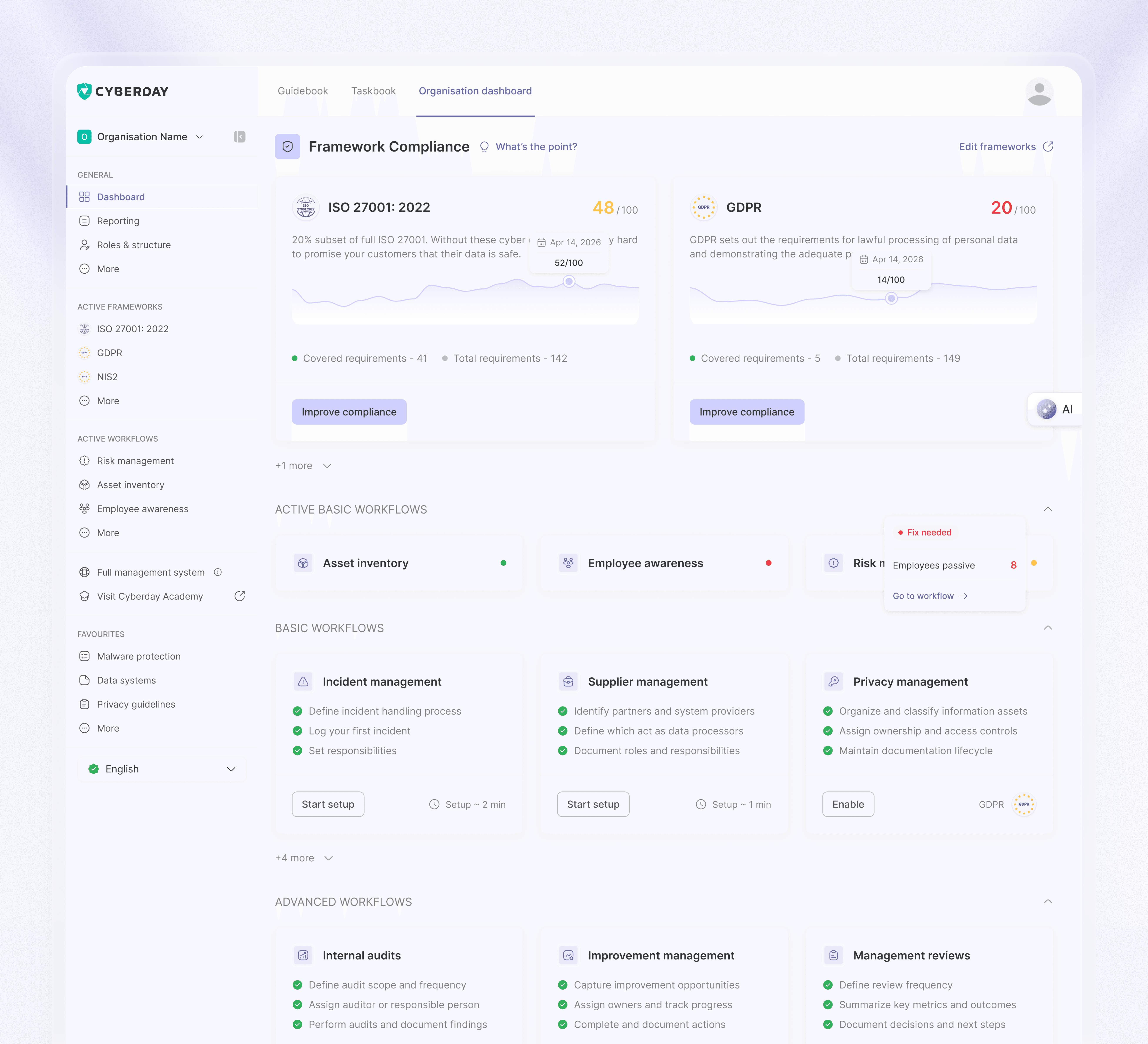
The Dashboard is home base — showing compliance score by framework and how it's trending. I reworked this view multiple times as the product grew, moving from simple progress numbers toward a clearer link between what tasks users had completed and how that specifically moved their compliance score, so the Dashboard felt like a direct result of the work being done, not an abstract number.
Two ways to work: Workflows or Themes
Users can follow a guided Workflow toward a specific goal, or browse directly by Theme, the underlying full management system organized by topic. When Workflows shipped, some existing users who were used to navigating by Theme lost track of how to find the same content. I adjusted the Theme-based navigation so it stayed clearly accessible and understandable alongside the newer guided path, rather than treating one as a replacement for the other.
Tasks
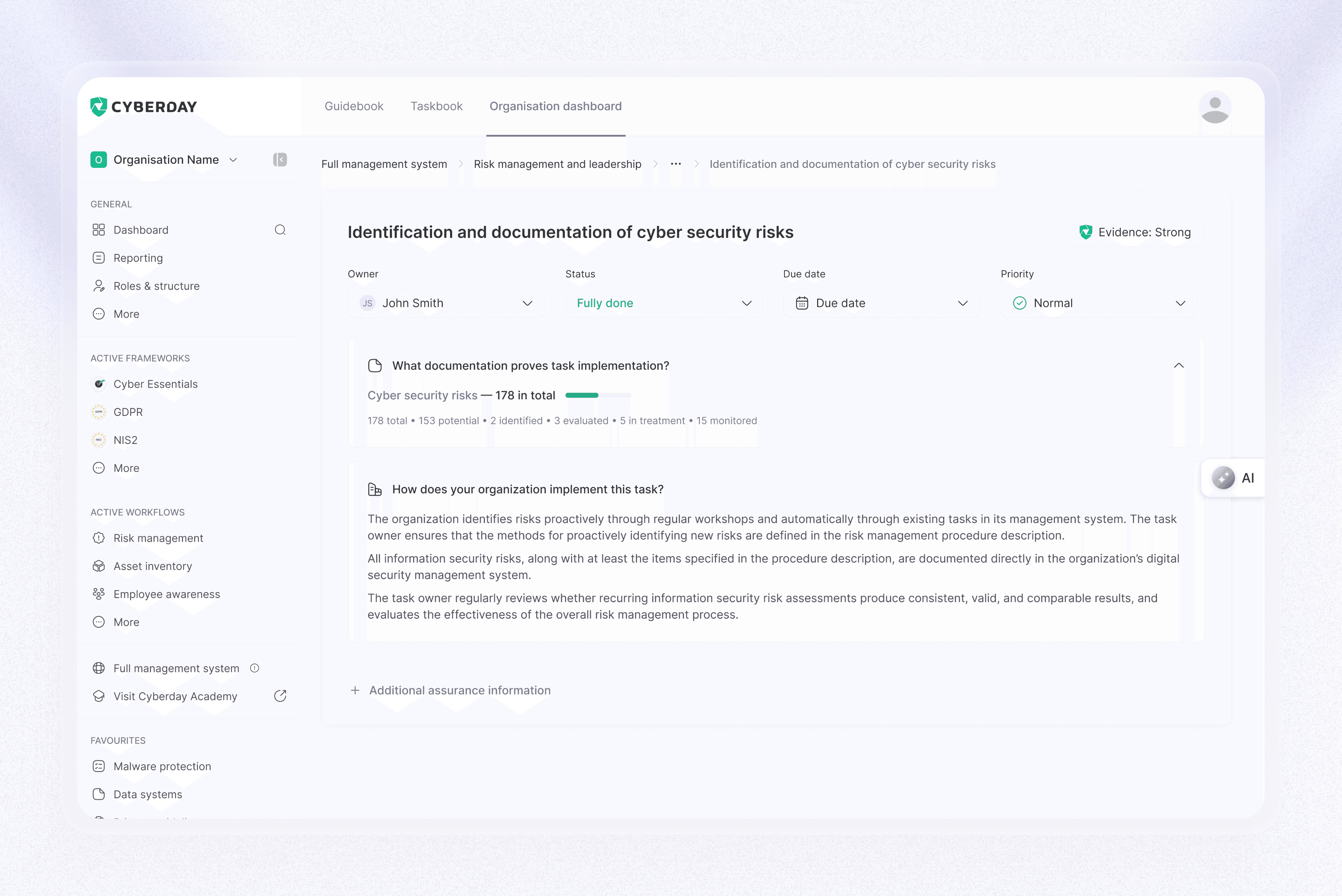
Either path leads to the same core unit of work: tasks. Each one can be strengthened through assurance methods — assigning an owner, writing a process description, linking supporting documentation, or connecting a security system. I redesigned how these methods appear on the task card as their number grew, introducing a simple strength indicator (none, weak, medium, strong) so users could see at a glance how solidly a task was actually backed up, instead of digging into each method individually.
Documentation, guidelines & risks
Underneath tasks sits the actual evidence supporting each one. Documentation holds the organization's compliance evidence — data stores, data systems, partner agreements, and more. Guidelines are instructions employees can be assigned directly, covering their specific security responsibilities. Risk entries let users identify, assess, and manage risks across the organization.
Compliance grows, and the report reflects it
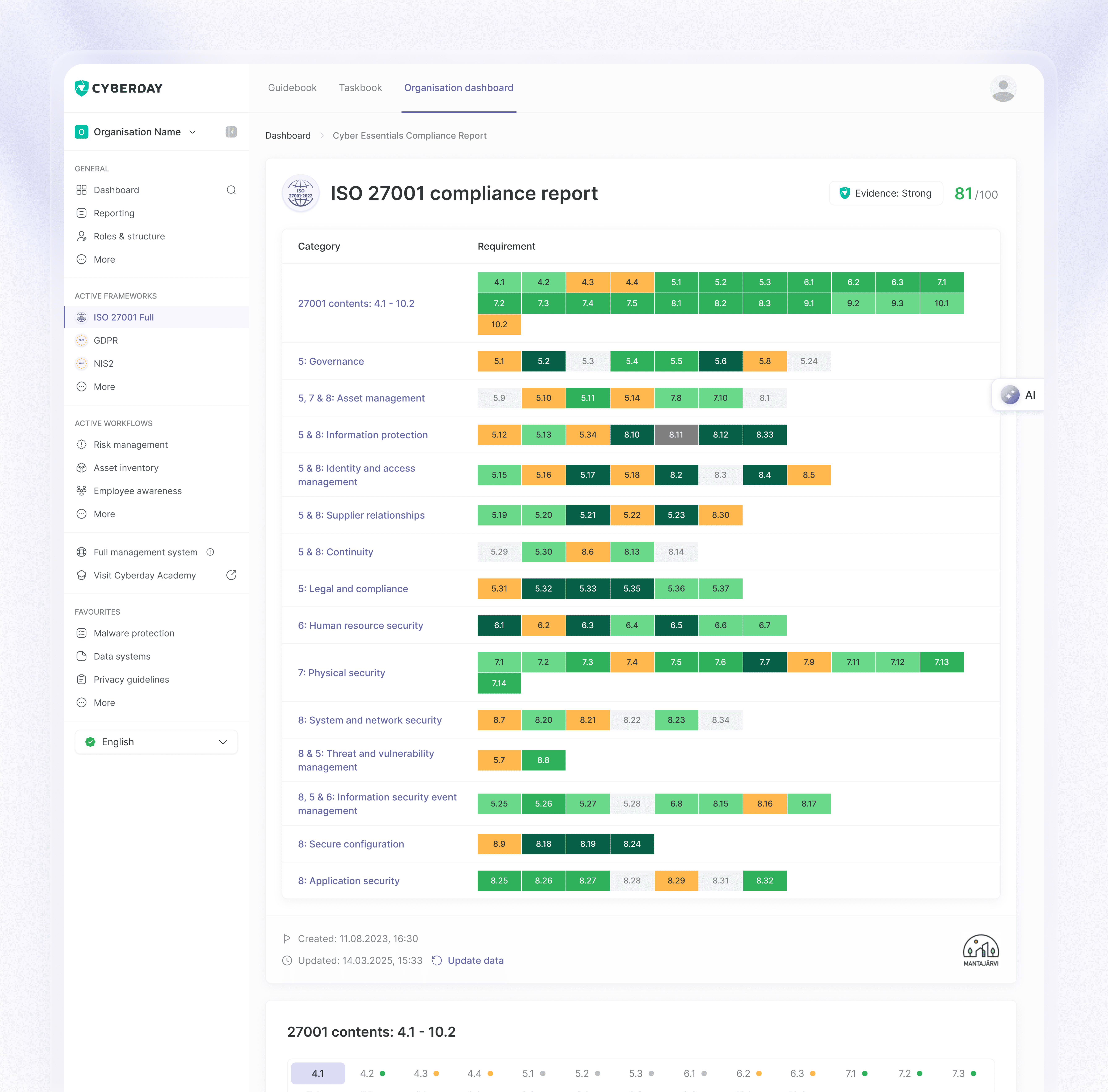
As tasks and policies fill in, the framework's compliance score rises — visible on the Dashboard and inside the Compliance Report. I worked on the report's structure and headers as it grew more complex over time, including a system of colored tags at the requirement level, so a reader — whether the internal team or an external auditor — can tell a requirement's status at a glance, without opening it to check.
Building the design system
I built out a full set of Figma variables — color styles, text styles, spacing and radius values, and a linked icon system — with both light and dark modes in mind from the start, so every element across the app could pull from one shared source of truth instead of being styled individually.
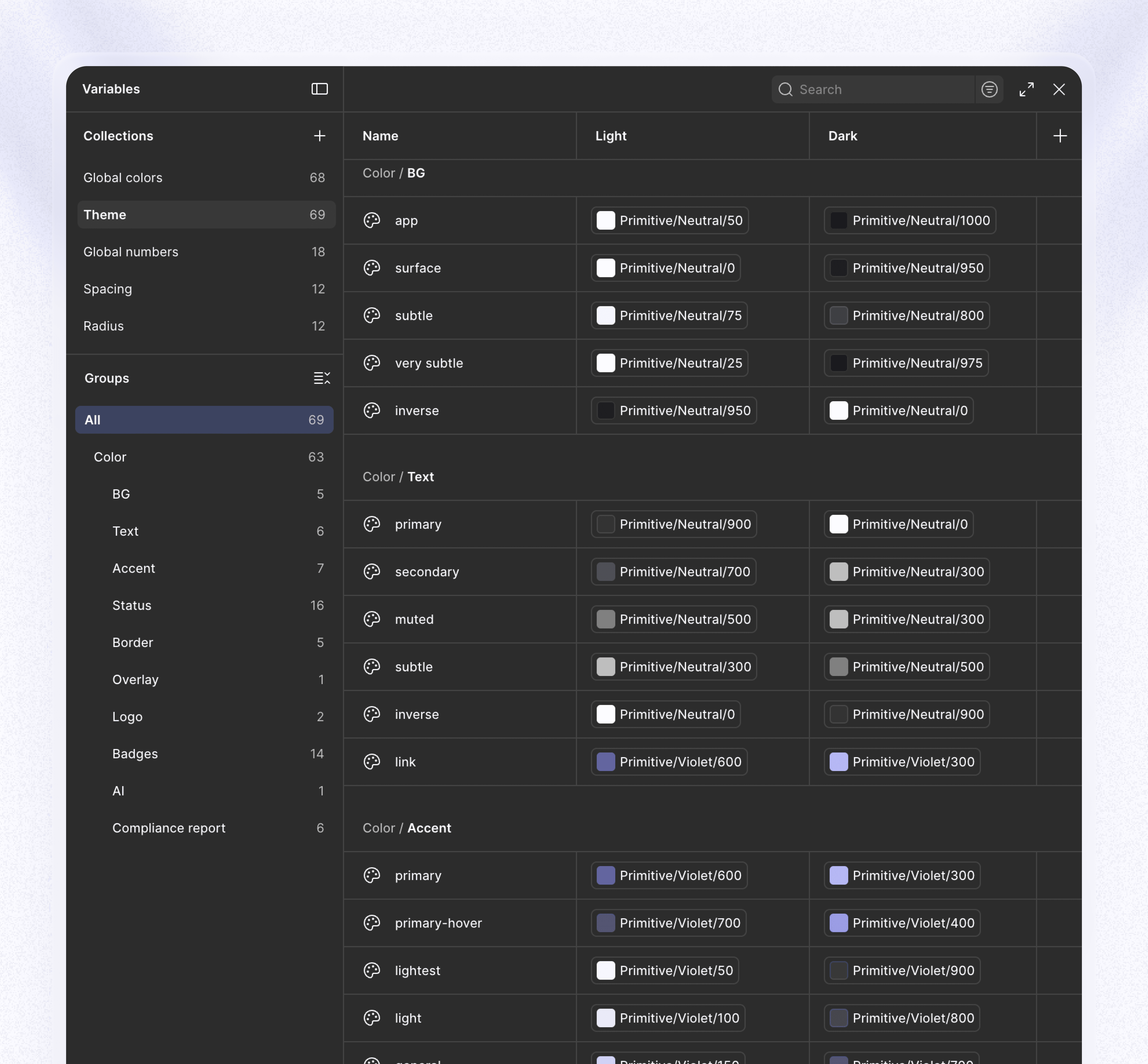
That foundation meant that when dark mode came up as one of the most-requested features on Cyberday's community feature board, converting most screens from light to dark was close to mechanical. A few areas, like report cards designed specifically for print-style light backgrounds, genuinely needed their own redesign rather than a simple color swap, and I treated those honestly as separate work.


Designing AI-assisted agents
As Cyberday introduced AI across its compliance workflows, I designed the interaction patterns for a growing set of specialized agents — a risk identifier agent, an internal audit agent, and a guideline creator agent among them — each scoped to one real compliance task rather than acting as a single general-purpose assistant.
Here's one of 16 agents in action.
Marketing work
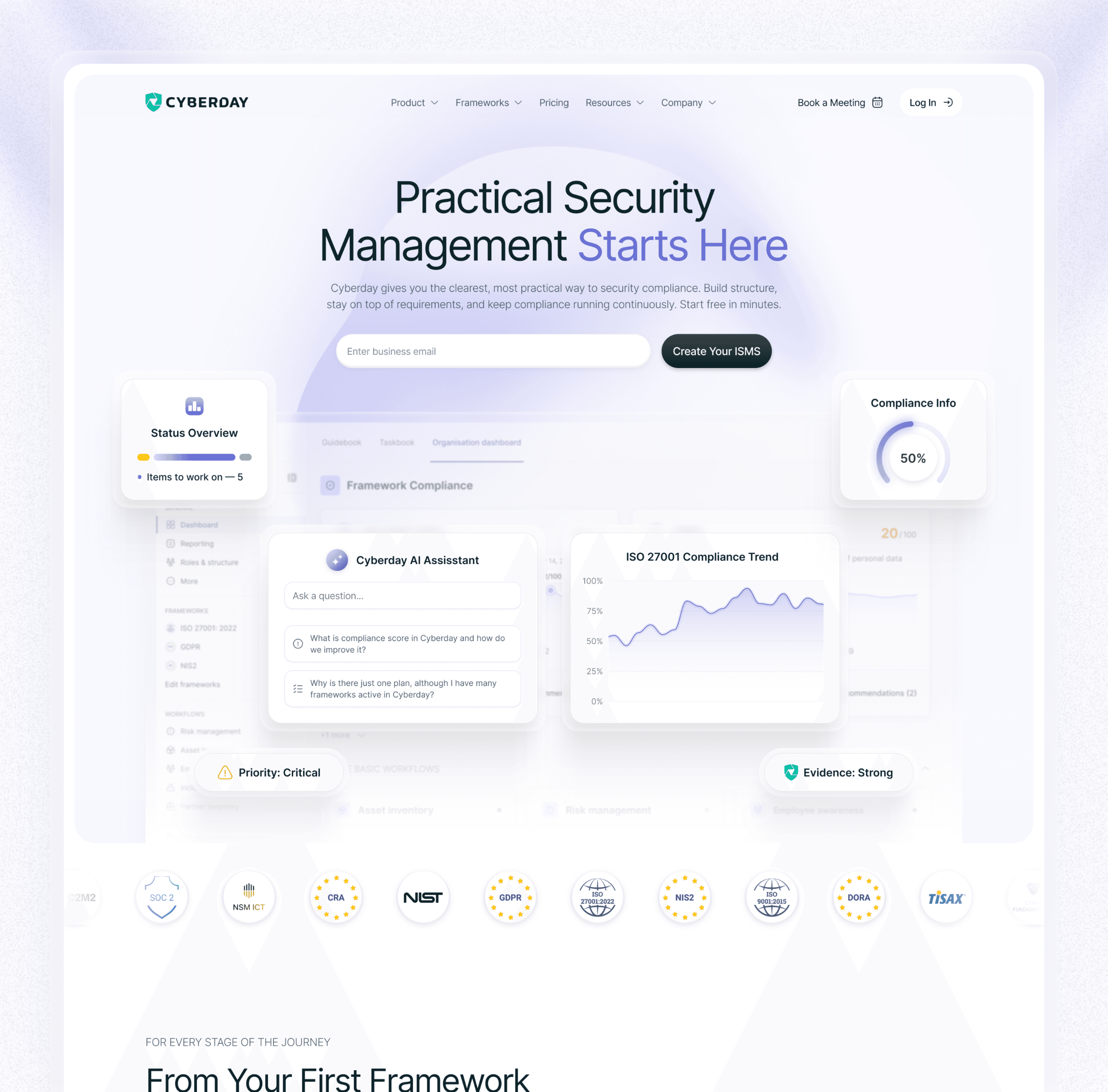
Alongside the app, I also designed Cyberday's website, ad banners, and sales decks — supporting the company's growth from the marketing side, not just the product itself.
Outcome
Across this engagement, Cyberday's own registered financial filings show the company growing from 3 employees and €365,000 in revenue in 2021 to 28 employees and €2.67 million in revenue by 2025. The product itself grew from a Finland-only tool into a platform serving 50,000+ users across 700+ companies in 20+ countries, supporting 80+ compliance frameworks. Independently of any of Cyberday's own marketing, Deloitte ranked Cyberday 33rd on its 2025 Technology Fast 50 for Finland, based on audited revenue growth over the past four years. The product holds a 4.5/5 rating on G2 and a 4.6/5 rating on Capterra, with reviewers specifically praising its "clear structure" and ease of organizing complex compliance work.
Reflection
Five years in, this is the project I've learned the most from. I watched a small, coded product with no design turn into something 50,000 people rely on. I built the system it runs on, redesigned how people actually use it day to day, and sat in on hundreds of small decisions that added up to something bigger than any one of them. I didn't do it alone — but I was there for all of it.