2024
Streams Charts
Website

Background
Streams Charts is a data analytics platform for streamers and businesses. A stakeholder came to us with a simple but open question: was the platform's structure really working for users, or had it just grown over time without anyone checking? Working alongside several other design teams as part of a UX design program, my team designed a new Platform Overview page from scratch, added a tool to compare platforms side by side, and cleaned up the visual noise across the existing charts.
Core problem
The original design had three issues:
Confusing navigation – there was no overview page to start from, so key metrics were buried deep in the menus with no clear entry point.
No easy way to compare platforms – users had no way to compare streaming services side by side.
Overloaded graphs – too many graphs shown at once, with no visual hierarchy to tell users what mattered most.
Together, these made the platform hard to navigate and hard to read. Users could technically click around it, but they struggled to find what they needed and to understand what the data was telling them once they got there.
Double diamond approach
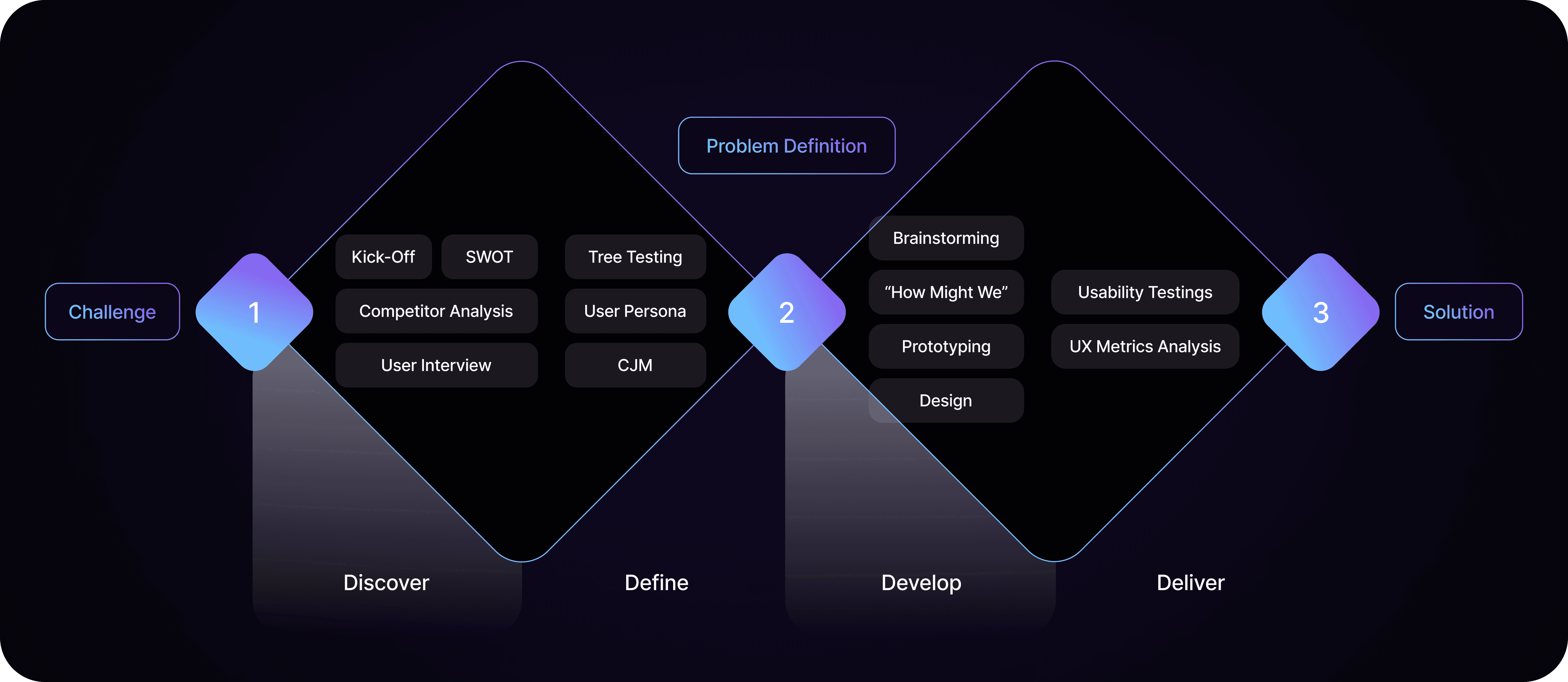
Discover → Kick-off discussion, competitor benchmarking, and user interviews.
Define → User personas, customer journey maps, and tree testing.
Develop → Brainstorming and "How Might We" questions.
Deliver → Usability testing and UX metrics.
Discover
The process started with a competitor analysis of 10 streaming analytics platforms, looking at how each one structures dashboards, displays data, and guides users through insights. Almost none of them made it easy to compare platforms side by side — a clear gap StreamCharts could fill.
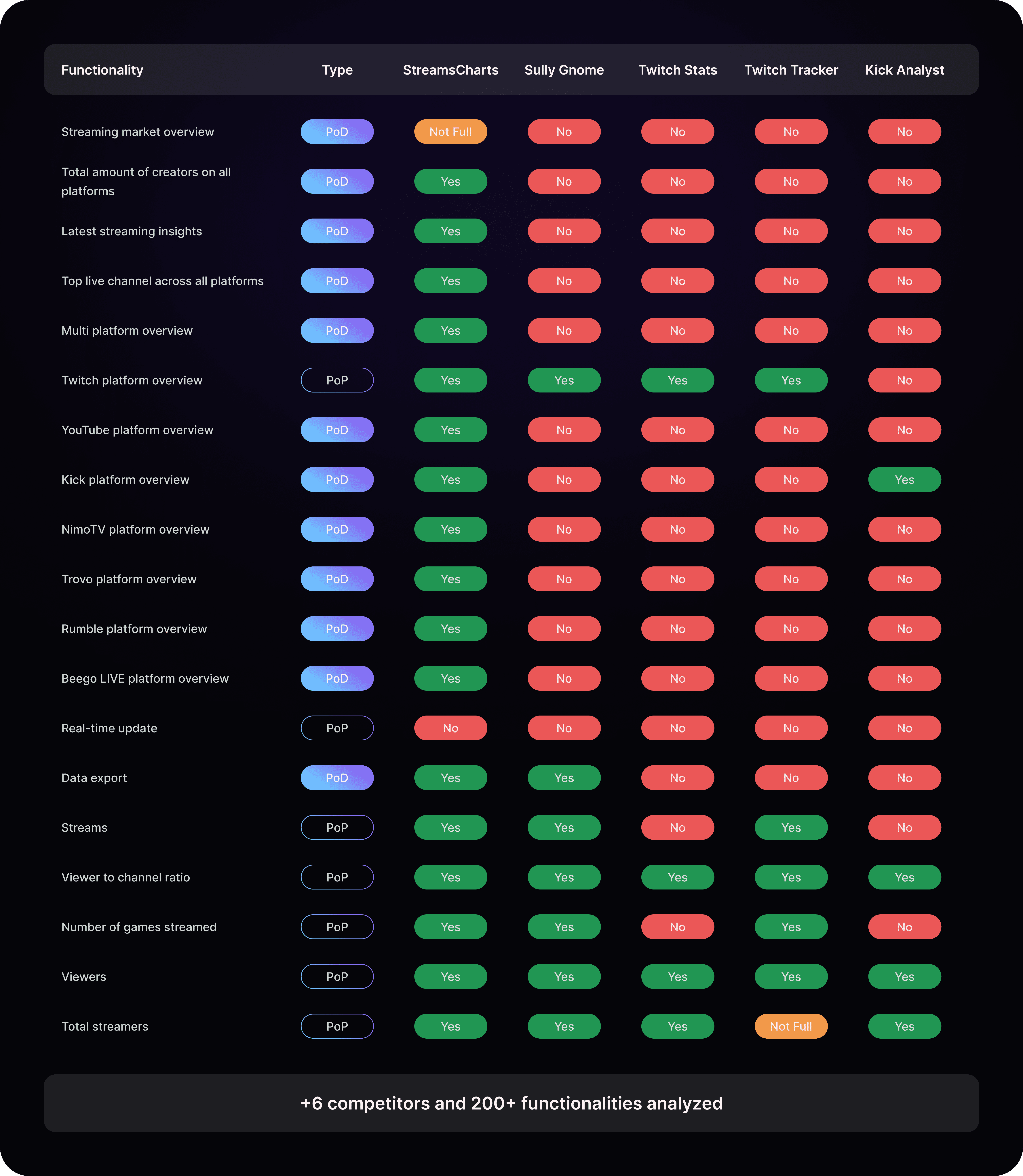
Next came a heuristic evaluation of StreamCharts and its competitors, based on Nielsen's usability heuristics. It flagged recurring issues with visibility of system status, recognition rather than recall, and aesthetic and minimalist design.
We also conducted user interviews, which shaped our personas and customer journey maps.
Define
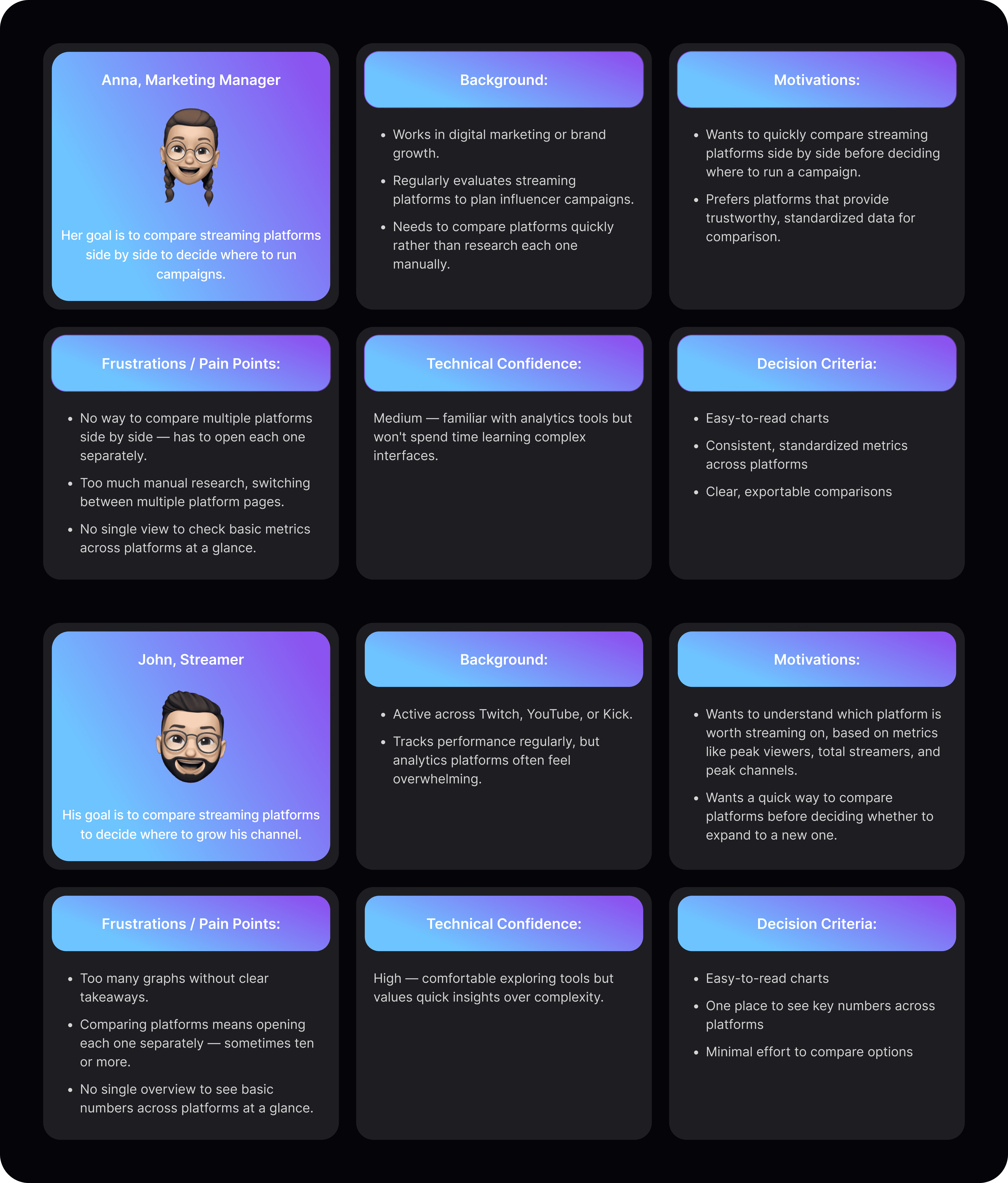
Two core personas were built from the interview findings — Business Buyer and Streamer — and their workflows were mapped through Customer Journey Maps to pinpoint frustration points and decision moments.
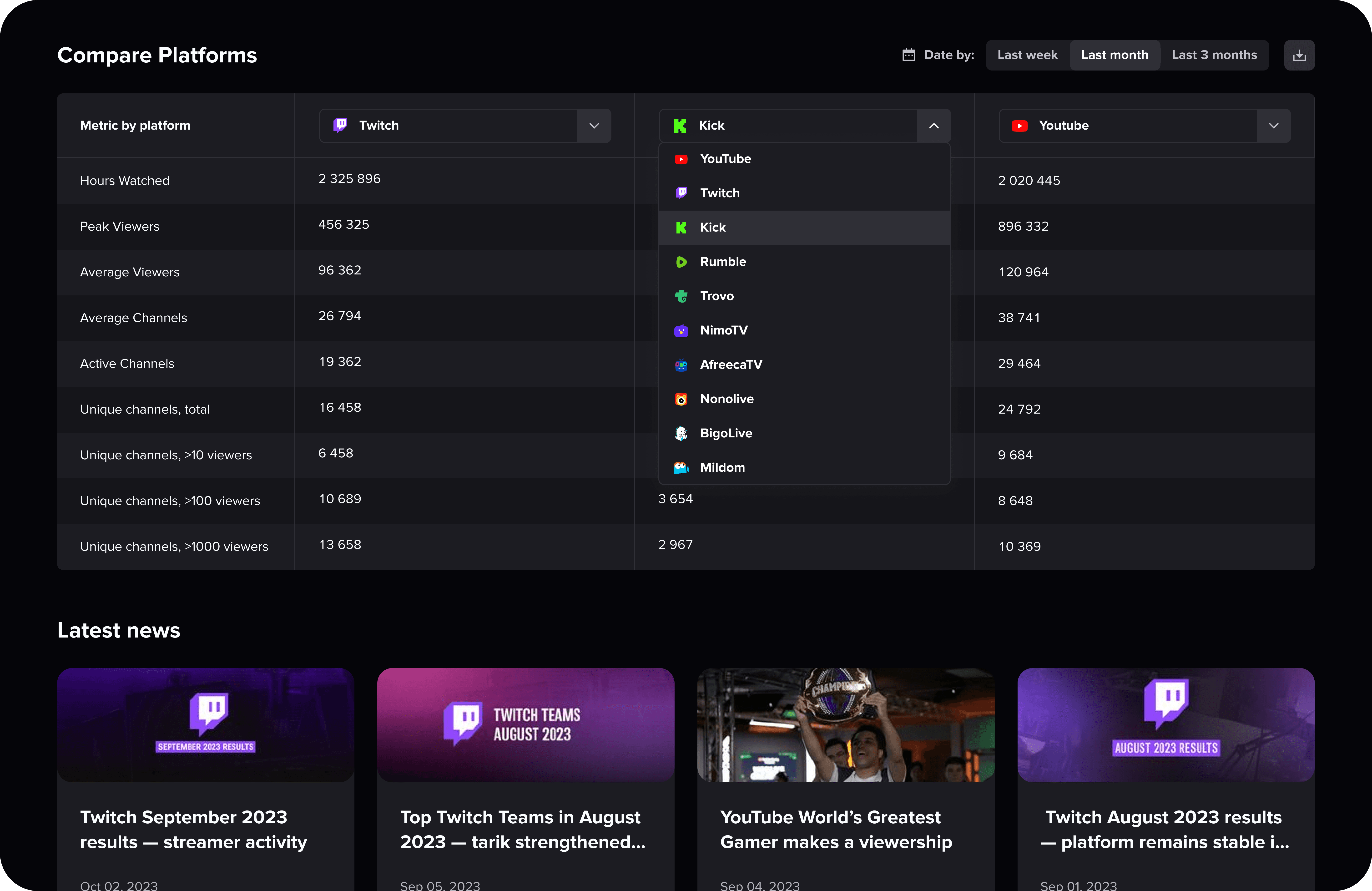
One gap showed up for both personas: no easy way to compare platforms or performance metrics side by side. For business users, this mattered most when evaluating streamer partnerships. For streamers, the same gap showed up when they wanted to check out another platform — comparing basics like peak viewers, total streamers, and peak channels meant opening each platform separately, sometimes ten or more, just to see the numbers side by side.

Tree testing with 83 users confirmed the navigation problem: people frequently got lost, took detours, and backtracked to find basic information.
Problem definition
Confusing navigation caused by a missing overview page
Without an "All Platforms" overview, users had no clear starting point. They landed on deep pages with no context, which made wayfinding worse.
No easy way to compare platforms
Business stakeholders and streamers needed to compare streaming services side by side. The product didn't support this, so they had to gather the data manually.
Overloaded graphs
Charts were visually dense and hard to read at a glance. Users said they had to "decode" the graphs instead of understanding the insights right away.
Develop
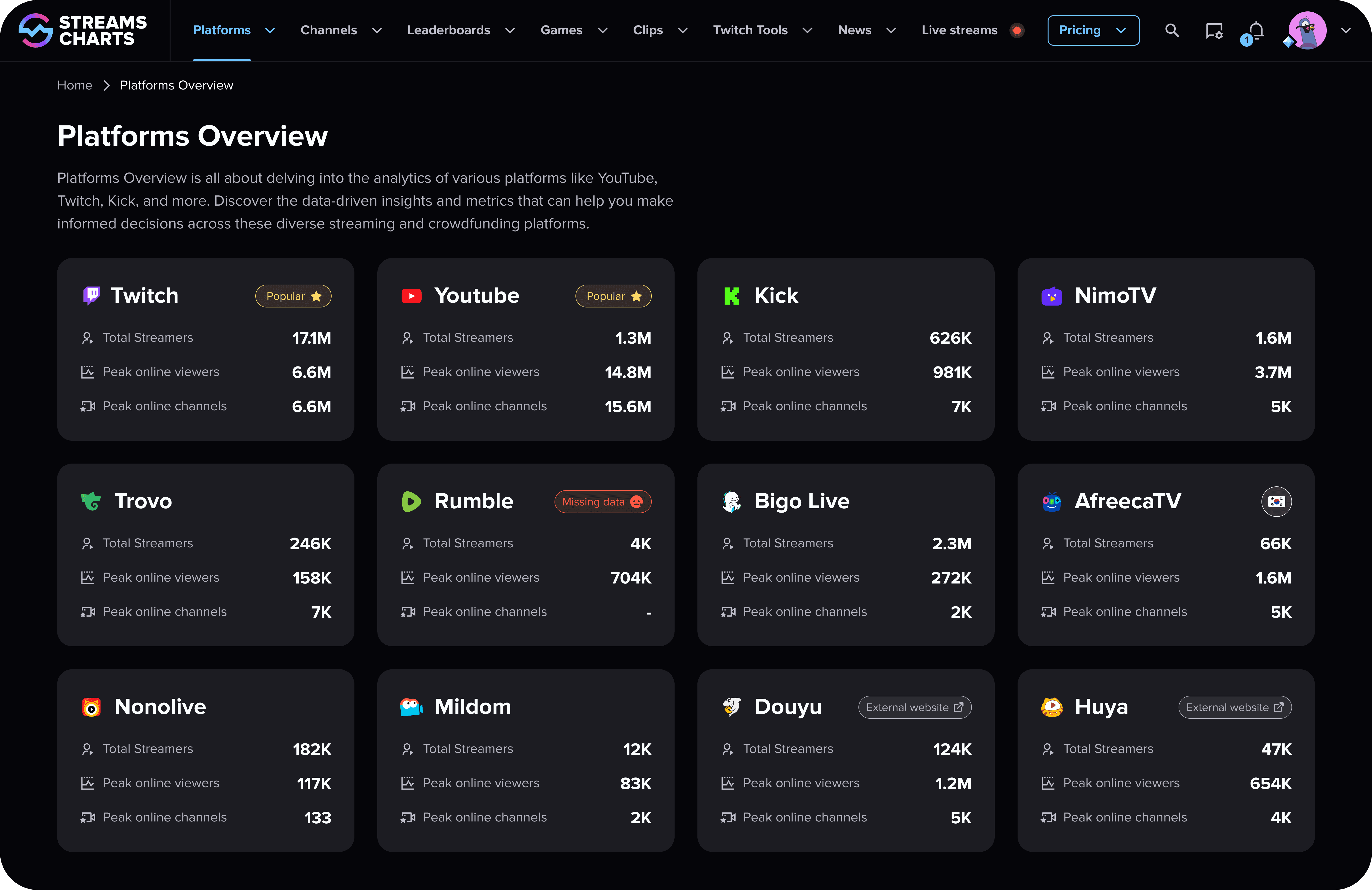
Before — Confusing navigation, no "All Platforms" overview.
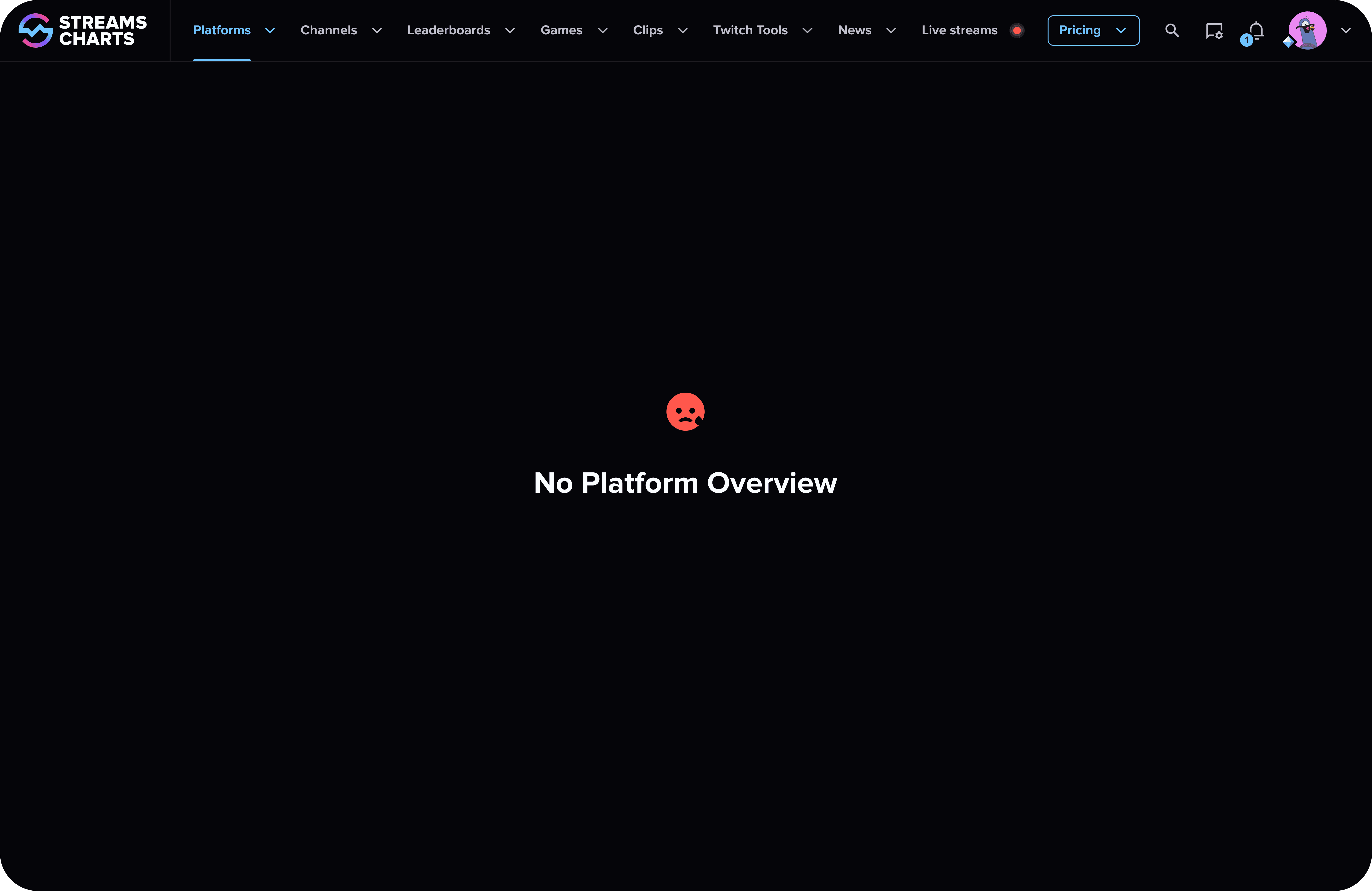
After — Introduced a "Platform Overview" page, linked it in the top navigation and breadcrumbs, and set it as the default entry point for platform-related routes.
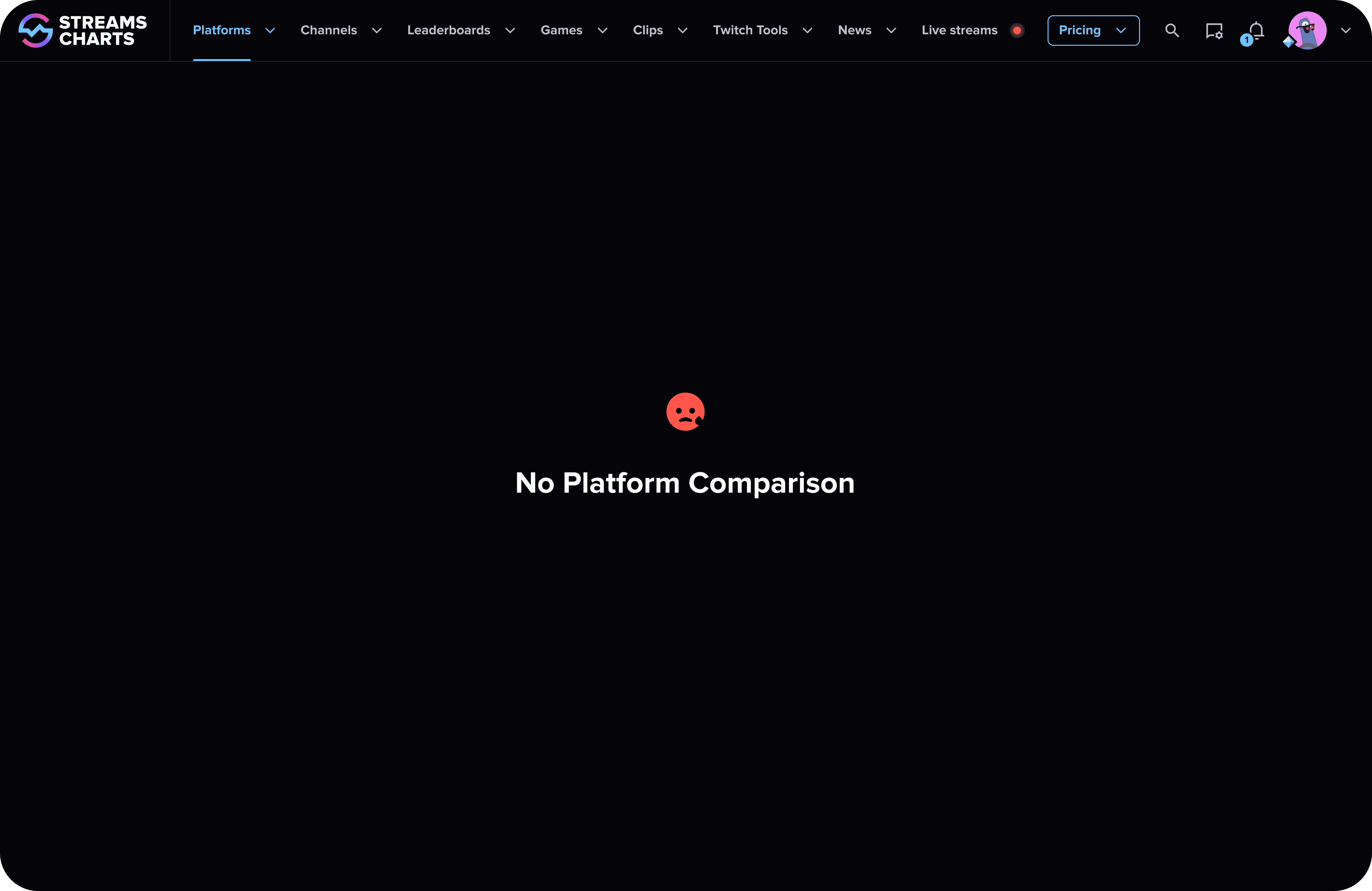
Before — No way to compare multiple streaming platforms.
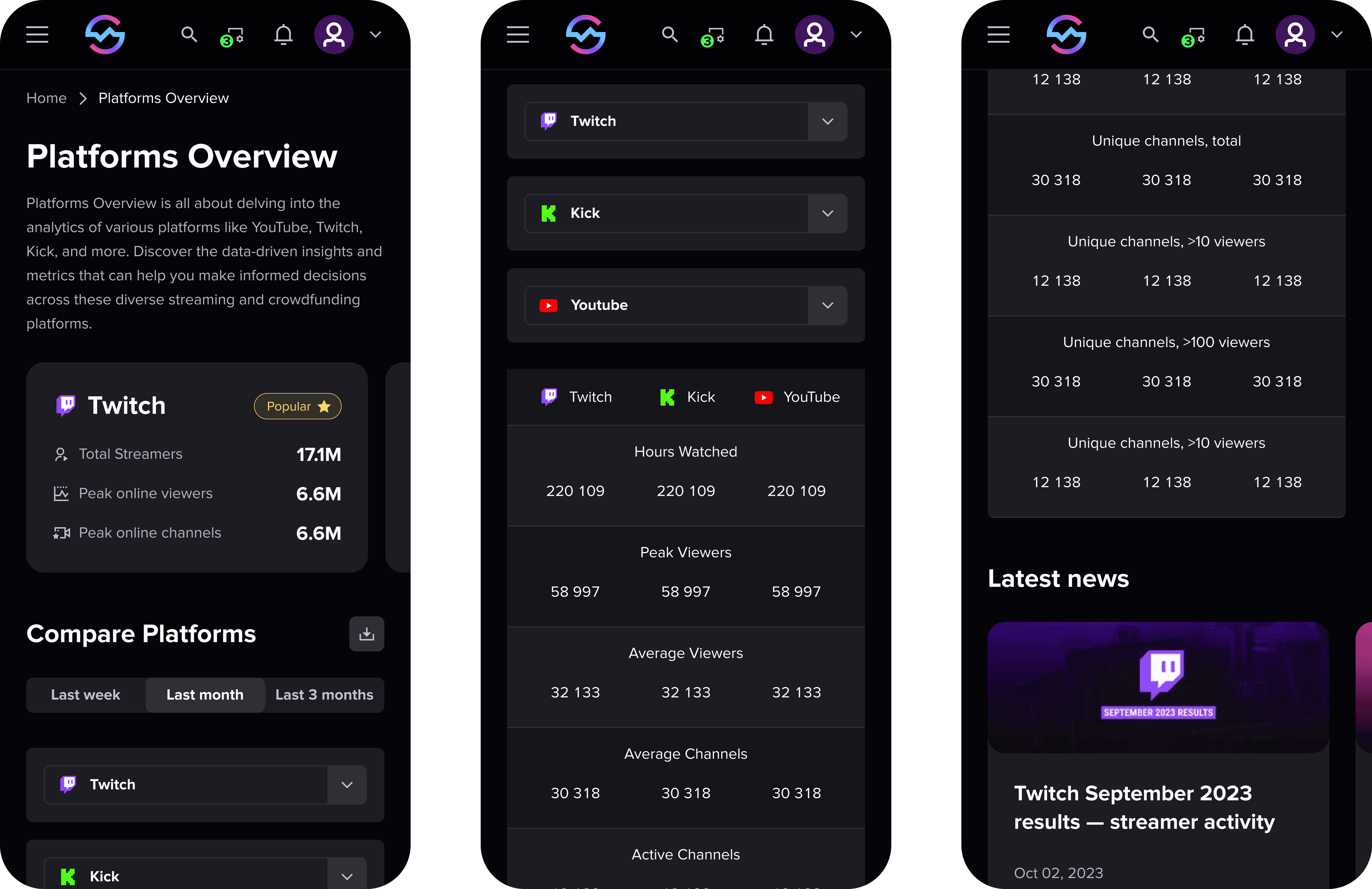
After — Built a side-by-side comparison table that lets users evaluate up to three platforms at once, with standardized metrics and inline filters.
Before — Overloaded graphs
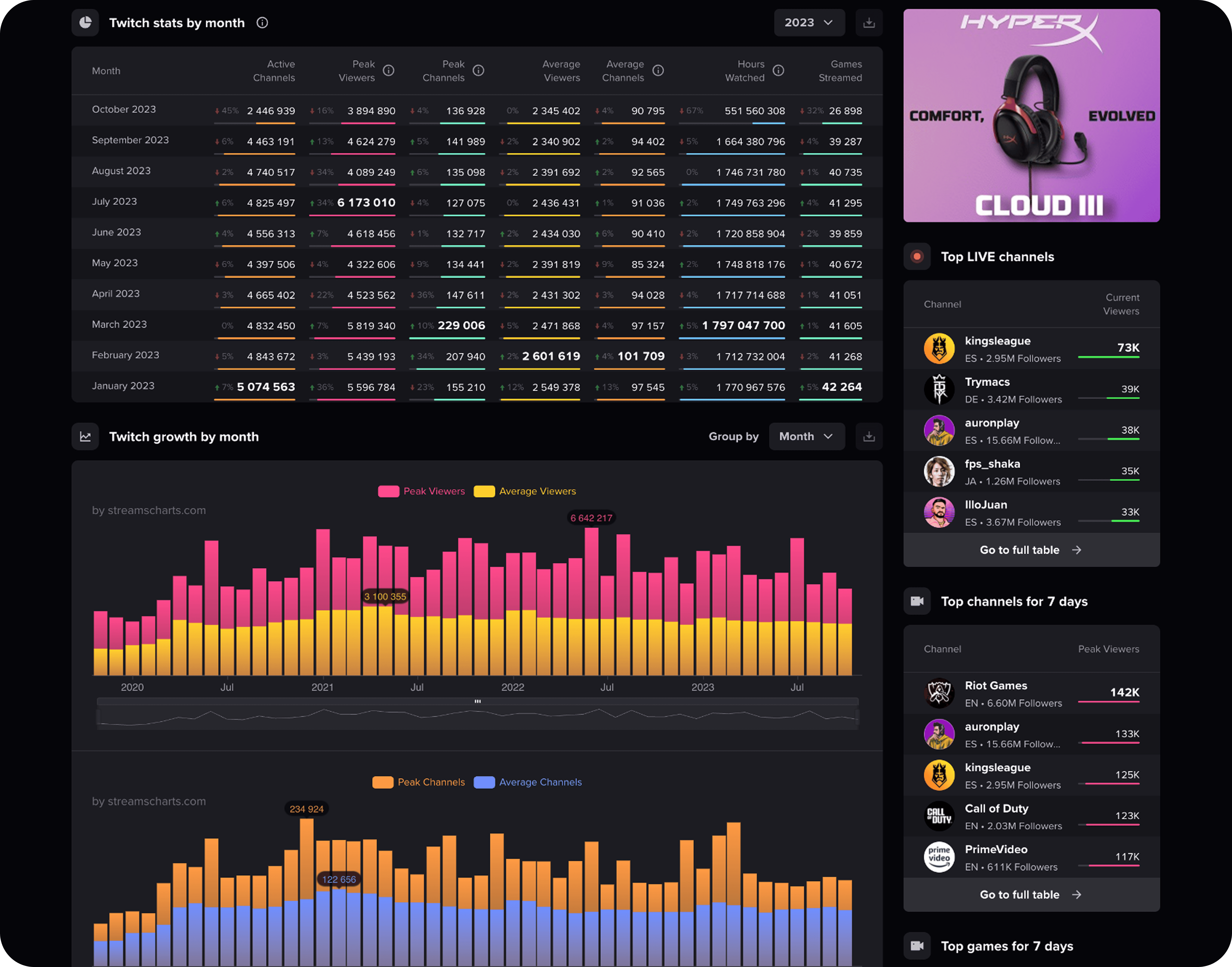
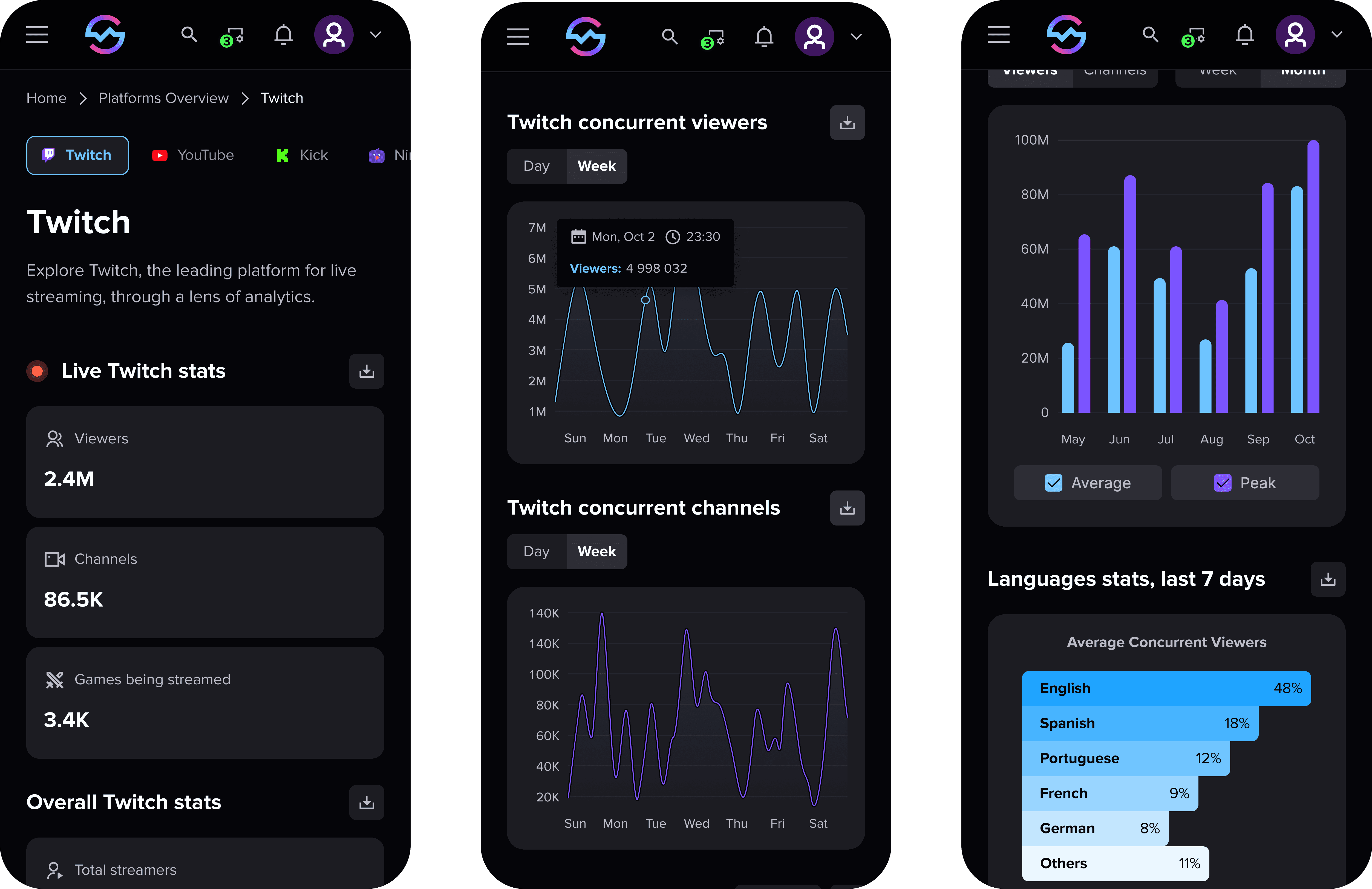
After — Cut visual noise by showing one metric per chart, moving secondary data to hover/details, and using a two-accent color palette for easier reading at a glance.
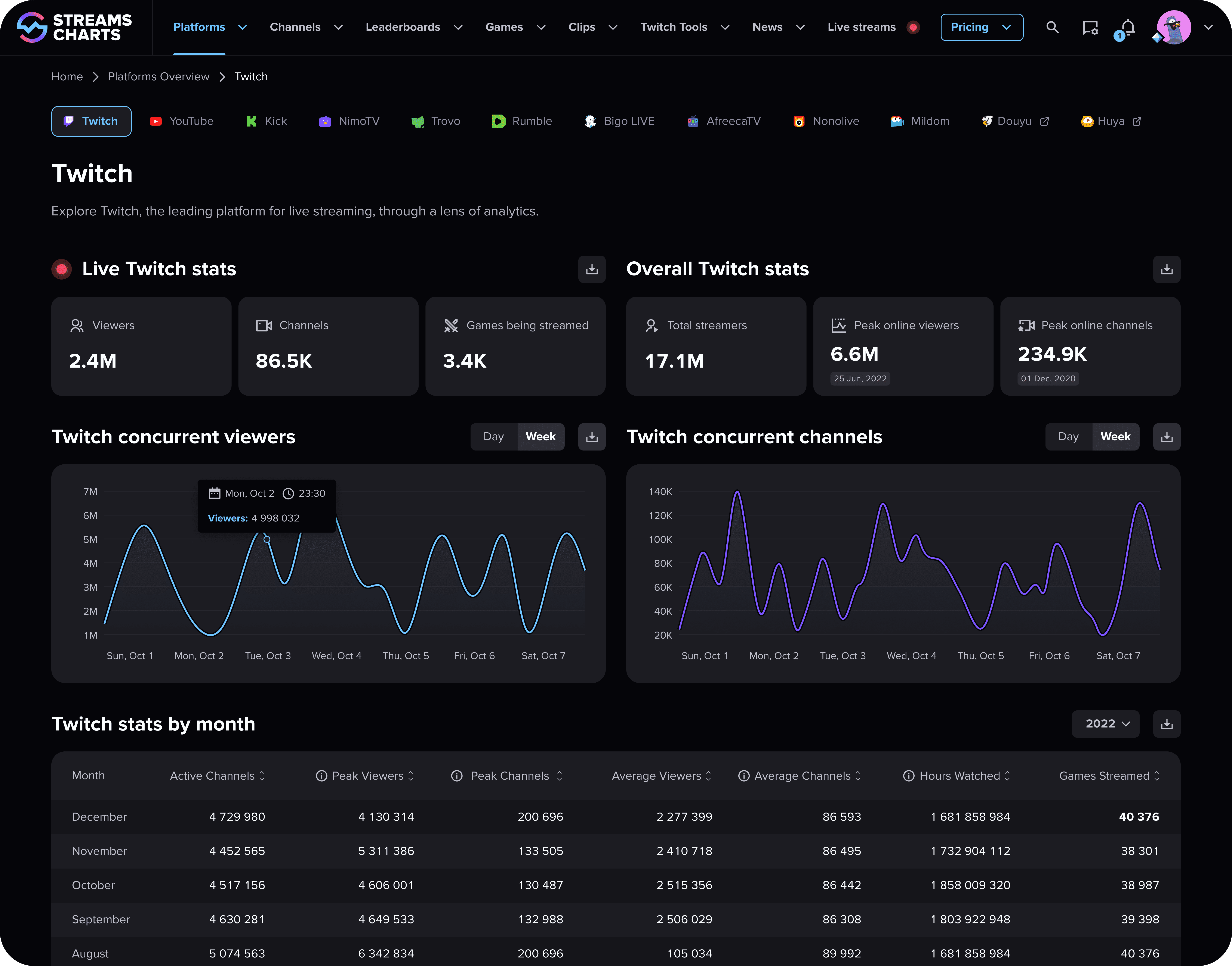
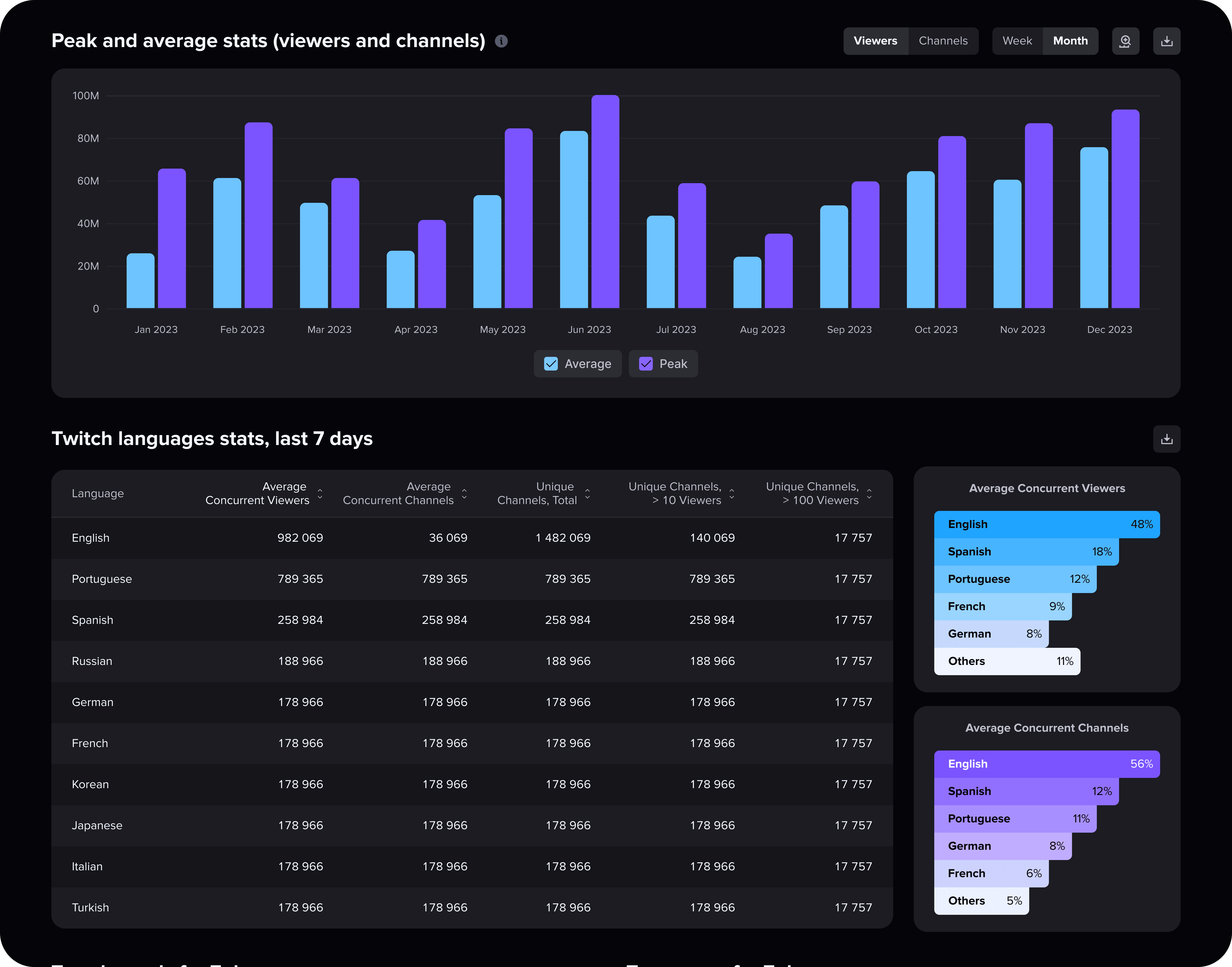
Responsiveness — The design was fully adapted for mobile: comparison tables became cards, and the layout worked without any horizontal scrolling.
Deliver
The redesign was validated with usability testing before and after the design changes: 18 moderated sessions and a 20-person unmoderated follow-up, across desktop and mobile, with a mix of returning and new participants. Participants worked through a set of representative tasks while task success, median time-on-task, first-click success, SUS, CSAT (1–5), and perceived ease (1–5) were measured.
Results improved across the board:
Task success: 64% → 91%
Median time-on-task: 2:40 → 1:32 (-43%)
First-click success: 52% → 85%
Perceived ease: 3.0 → 4.5/5
CSAT: 3.2 → 4.4/5
SUS: 60 → 82 (grade B)
A follow-up tree test after the navigation restructure separately showed a 35% improvement in navigation task success.
Outcome
A few months after the engagement, StreamCharts' internal team launched their own version of the Overview page.
Two years later:
The Overview page is still live two years later.
The comparison tool is now a paid feature for Pro accounts.
The final interface moved toward a more minimal color palette, in line with the direction we proposed.
Taken together, this points to more than a one-time approval — the direction we designed held up in production and is still shaping the product two years later.